
Journal
Before You Start That Big Project…

Last week I shared an article by Nancy Kazlauckas about how she tests Paintstik colors for a project. I’m not quite as methodical as Nancy, but I did use her color testing method before I started painting on my big 3-panel project.
In this case, a couple of hours up front saved me a lot of misery later. When you are working on something BIG, you want to make sure you are happy with your colors before you start on the real thing.
Test the Colors
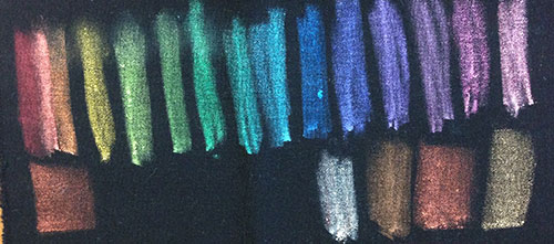
The first step was easy. I painted out a section of each Iridescent Paintstik color on a scrap of the fabric for my project.
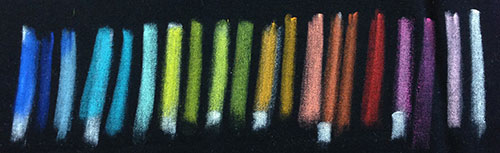
Next, I went through the Matte Paintstik colors to see what might be useful. When I tested the matte colors, I checked each one to see what they looked like directly on the black fabric and how they looked over a base of Titanium White. (The Titanium White is very opaque and it acts like a primer on the black fabric.)
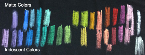
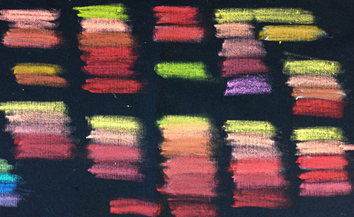
Finally, I made a 3rd sample using both sets of colors. To keep things straight, I put the iridescent colors on one side of the fabric and the matte colors on the other.
You may notice that I don’t have nice labels on my test swatches. It’s more work to label black fabric — and I was being a bit lazy. I’ve spent more than 15 years working with these paints, so I can pretty much pick out a color with just a quick glance. Even so, I had to open the paint box to double check a color as I was taking my photos. It really is best to label your color tests — even if it means attaching a list on a piece of paper.
Test the Combinations
The design for my project was made up of medallions. I wanted the colors of each medallion to radiate out from the center. I had decided that I wanted smooth, analogous combinations, so it was time for some experiments. (Analogous is a fancy word for colors as in those that are right next to each other on the color wheel.)
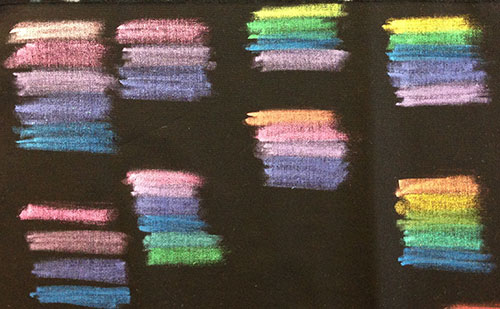
Now, my brain really likes color wheels, so this was fun. I tested pinks, purples and blues.
Then I played with warm color combinations in all shades of yellow, orange and red.
Finally, I messed around with the yellow-green-blue combinations.
After playing with bunches of color combinations, I was feeling much more confident about painting the panels for my project. But I wasn’t totally sold on some of my choices.
Next week I’ll show you the final tests. It was definitely worth the extra effort!
Your Turn
Do you do “test runs” on your projects to test colors or methods? I’d love to hear about what kinds of things you test and how you do that. Leave a comment here or click over to our Facebook Page.
I just received my paintstiks yesterday. I’ve never used them before and this information will help me get started.
THANK YOU for sharing!
You are most welcome, Gerrie. It’s always nice when a bit of information shows up at just the right time. 🙂
[…] a previous post, I talked about testing paint colors before starting work on a big project. Today I want to talk […]